reproducible geospatial visualization in kepler.gl
Jinja templates in jupyter for kepler.gl
Effortless and great looking visualizations can be achieved using https://kepler.gl/. However, kepler by itself is tedious to use as updating the data files like you might have done with QGIS or ArcGIS does not work on the website.
This is easily fixed with the kepler.gl python package. Using tools like pandas and jinja templates these visualizations can be created once via drag and drop and then loaded programmatically by storing the configuration in git.
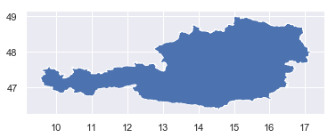
An example visualization will be created below to contain hexagons within the boundaries of Austria.
MAPBOX_ACCESS_TOKEN = 'your_API_token'

%pylab inline

import pandas as pd
import seaborn as sns; sns.set()
import geopandas as gp
from h3 import h3

from shapely.ops import unary_union
from shapely.geometry.polygon import Polygon

from keplergl import KeplerGl
import json
import jinja2

def python_dict_to_json_file(dict_object, file_path):
    try:
        # Get a file object with write permission.
        file_object = open(file_path, 'w')

        # Save dict data into the JSON file.
        json.dump(dict_object, file_object, indent=4)

        print(file_path + " created. ")
    except FileNotFoundError:
        print(file_path + " not found. ")


def jinja_json_to_dict(env, template_name, **kwargs):
    """Convert JSON Jinja2 template to dictionary and apply variables from kwargs."""
    template = env.get_template(template_name)
    return json.loads(template.render(kwargs))
The dataset from GADM: https://gadm.org/data.html is great for a quick visualization. Let’s download it first:
!wget https://biogeo.ucdavis.edu/data/gadm3.6/gpkg/gadm36_AUT_gpkg.zip
and unzip it as the next step.
!unzip gadm36_AUT_gpkg.zip
you receive a geopackage file containing multiple layers.
%ls
gadm36_AUT.gpkg            license.txt
gadm36_AUT_gpkg.zip        reproducible_kepler.ipynb
data generation
Using geopandas we can load a single layer with the national borders of Austria. As they are represented as two POLYGONS within the MULTIPOLYGON and tools later in the process expect a single geometry and not a geometry collection this needs to be fixed up quickly:
df = gp.read_file('gadm36_AUT.gpkg', driver='GPKG')

# fixup geometries to be a single polygon
polygons = df.geometry.apply(lambda x: list(x))[0]
polygons.append(polygons[0].intersection(polygons[1]).buffer(0.0001))
combined = [unary_union(polygons)]
df.geometry = combined


display(df.head())
df.plot()
| GID_0 | NAME_0 | geometry | |
|---|---|---|---|
| 0 | AUT | Austria | POLYGON ((10.45455919 47.55573654, 10.45455870... |
To fill the shape with hexagons it needs to be converted to geojson first:
gj = gp.GeoSeries([df.geometry[0]]).__geo_interface__
geoJson = gj['features'][0]['geometry']
Then the polyfill function of h3-py can be used. Be aware of the geo_json_conformant parameter. You will most likely need to set it to True to find your hexagons on the right place on the globe, i.e. not flipped.
In case you are in an enterprise setting where the installation of h3 or h3-py fails as the build scripts assume to be run on the open internet:
Don’t worry, both packages are available on conda-forge https://github.com/conda-forge/h3-py-feedstock and install nicely now. By the way I am one of the maintainers of these packages.
Let’s generate the hexagons:
res = 8
hexagons = pd.DataFrame(h3.polyfill(geoJson, res, geo_json_conformant=True), columns=['hexagons'])
hexagons['value'] = 1 # some dummy data we want to plot at the map
hexagons.head()
| hexagons | value | |
|---|---|---|
| 0 | 881f892551fffff | 1 |
| 1 | 881e3221b7fffff | 1 |
| 2 | 881e336729fffff | 1 |
| 3 | 881e150427fffff | 1 |
| 4 | 881e105937fffff | 1 |
visualization
The default dark theme of kepler already is quite nice.
To demonstrate how to create even more custom visualizations try to use a different basemap one good looking example is the streets default from mapbox available at mapbox://styles/mapbox/streets-v11.
To instanciate a fresh map and load the data run:
prototype_map = KeplerGl(height=700)
prototype_map.add_data(data=hexagons, name=f'res-{res}')
prototype_map
You will receive an empty map. But when clicking on the arrow in the upper left hand corner you should notice that one data file has already been loaded.
Apply some configuration changes like the suggested change of the background color.
Most importantly do not forget to add a new Hexagonal layer to visualize the data.
The result should be similar to: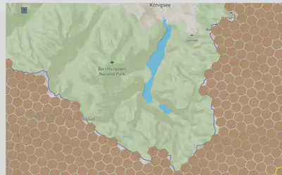
templates directory.
You need to create it, if it does not exist yet:
!mkdir templates
Now you can store it:
# uncomment to overwrite existing template
python_dict_to_json_file(prototype_map.config, 'templates/introduction.j2')
reproducibly apply existing configuration
When applying an existing visualization, stored like outlined above, you need to:
- Instanciate a new map
- Load the data files and add them to a new map
- Load the existing jinja template to visualize all the layers
This is achieved with:
from jinja2 import Environment, PackageLoader, select_autoescape, FileSystemLoader
env = Environment(
    loader=FileSystemLoader('templates/'),
    autoescape=select_autoescape(['html', 'xml'])
)

eval_map = KeplerGl(height=700)
eval_map.add_data(data=hexagons, name=f'res-{res}')

config_dict = jinja_json_to_dict(env, 'introduction.j2')
eval_map.config = config_dict
eval_map
Now you should see the same map as clicked together using drag and drop before. As a last step we can store the map in a HTML file to hand it to other people ore share it on a website.
eval_map.save_to_html(file_name='eval_map.html')
In case you do prefer drag and drop tools without code - be aware that kepler.gl recently started to be available as a Tableau plugin: https://extensiongallery.tableau.com/products/108.
summary
It is easy to use kepler.gl, but by itself it is tedious to inclide it inside a workflow where data is updated for an existing visualizatio. Such shortcomings are fixed by the approach outlined above where a minimal amount of python code is used to reproducibly load the configuration of the visualization.
You can extend this and create a true Jinja template with actual variables. Using this you could loop over additional dynamically added data files and generate new visualization layers according to a template.
Georg Heiler
Researcher & data scientist
My research interests include large geo-spatial time and network data analytics.